Pack Up + Go
From 2022-2024 I was the sole graphic designer for Pack Up + Go, the leading surprise travel brand in the US. As their first and only full-time designer, I was tasked with streamlining the brand and redesigning all of the assets it came with. This included many print assets, merchandise, social media content, email automations, the website, and everything in between. It was a huge lift, and I was eager for the challenge.
The Website
The Problem
Pack Up + Go’s website did not feel legit - because of this, not only were users not converting, but they weren’t really spending much time on the website at all. The site felt bare bones, yet too text-heavy at the same time - there were some pretty pictures, but they read like stock images and appeared untrustworthy. There was a major disregard for the user experience, and the site was not compliant with accessibility standards. Furthermore, there were no real brand standards set in place, and after auditing all graphic assets, I found that more than 10 different unnecessary typefaces were used throughout. This lack of consistency appeared to be confusing to consumers.
The launch of the new website and brand refresh was a smash hit - we saw increases in time spent on the site and click rates, and decreases in bounce and exit rates. Major improvements in the user experience and overall look and feel of the brand itself proved to be successful.
Before
Solution: less corporate, more excitement, and real traveler images that users can actually relate to. Multiple CTAs were added above the fold to encourage users to navigate through the site or move on to the booking platform. I created hierarchy with primary, secondary and tertiary buttons. After the redesign, we developed an abandoned cart email series automation from which we immediately saw an increase in conversions.
Before
Solution: I implemented a standardized set of more than 70 graphic “icons” that were used across the website and other assets in order to create consistency within the brand. A single primary button was added to encourage users to navigate further. I made major alignment and spacing changes to ensure accessibility and readability standards were in place.
I optimized for mobile after finding that over 80% of our users were accessing the website via their cell phones. In order to further increase brand trust, we launched a public reviews initiative that had been years in the making. I implemented Trustpilot widgets throughout the website and email for users to have access to real, unbiased reviews.
-21%
Bounce rate
-12%
Exit rate
+102%
Avg. time spent on site
+23%
Avg. click rate
The Icon Suite
One aspect of refreshing Pack Up + Go’s brand was to standardize its graphic icon style. Icons were involved in many of Pack Up + Go’s branded materials, and interns throughout the years had created different versions of icons, all slightly different from the ones before. I defined the look of our icons and created standards that were easy to follow and repeat to create the exact same style. These are a select few of those icons.
Prior to my time at Pack Up + Go, there was a very minimal email marketing effort. Seeing how many potential conversions we were missing, I helped lead efforts to move into Hubspot and created multiple automated email series. To gather more information about our users, I designed a survey at the end of the abandoned cart series to gather information on how we could improve our product and experience.
The Surprise Envelope
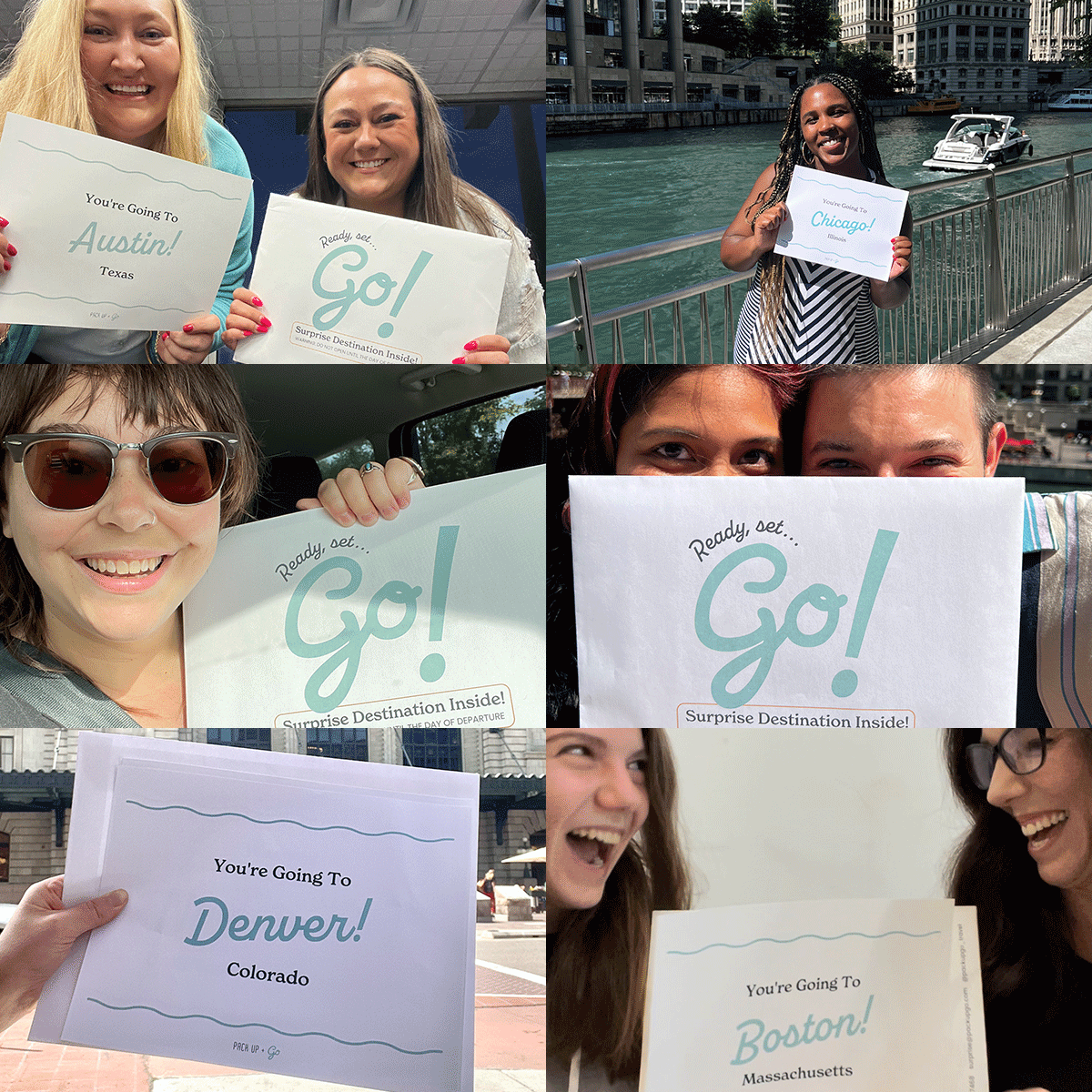
The biggest excitement builder for Pack Up + Go is their surprise envelope, which contains everything they need to get started on their mystery vacation. The most thrilling part? Within the envelope is a destination reveal, which travelers eagerly anticipate looking at the day they depart. I redesigned and reformatted all of these print assets for consistency.
Included in the surprise envelope are limited-edition themed postcards and stickers as fun keepsakes for travelers. This is the mid-century modern set.

